"How might we increase the relevancy of customers’ money insights across Money Management ecosystem in CommBank App?"
219
K
93
%


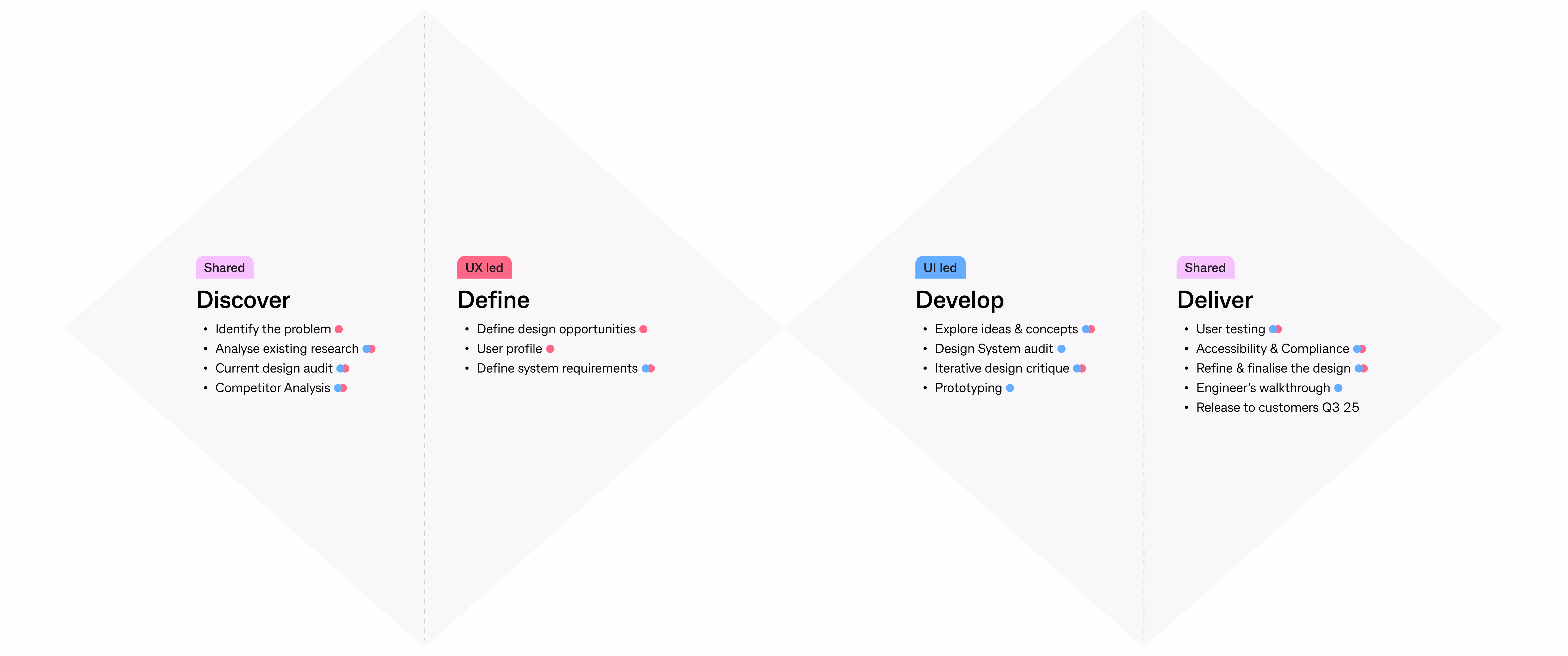
DESIGN PROCESS

Confusion and disengagement
Users often saw insights that didn’t match their income rhythm, making the tool feel irrelevant or inaccurate.

Manual adjustments
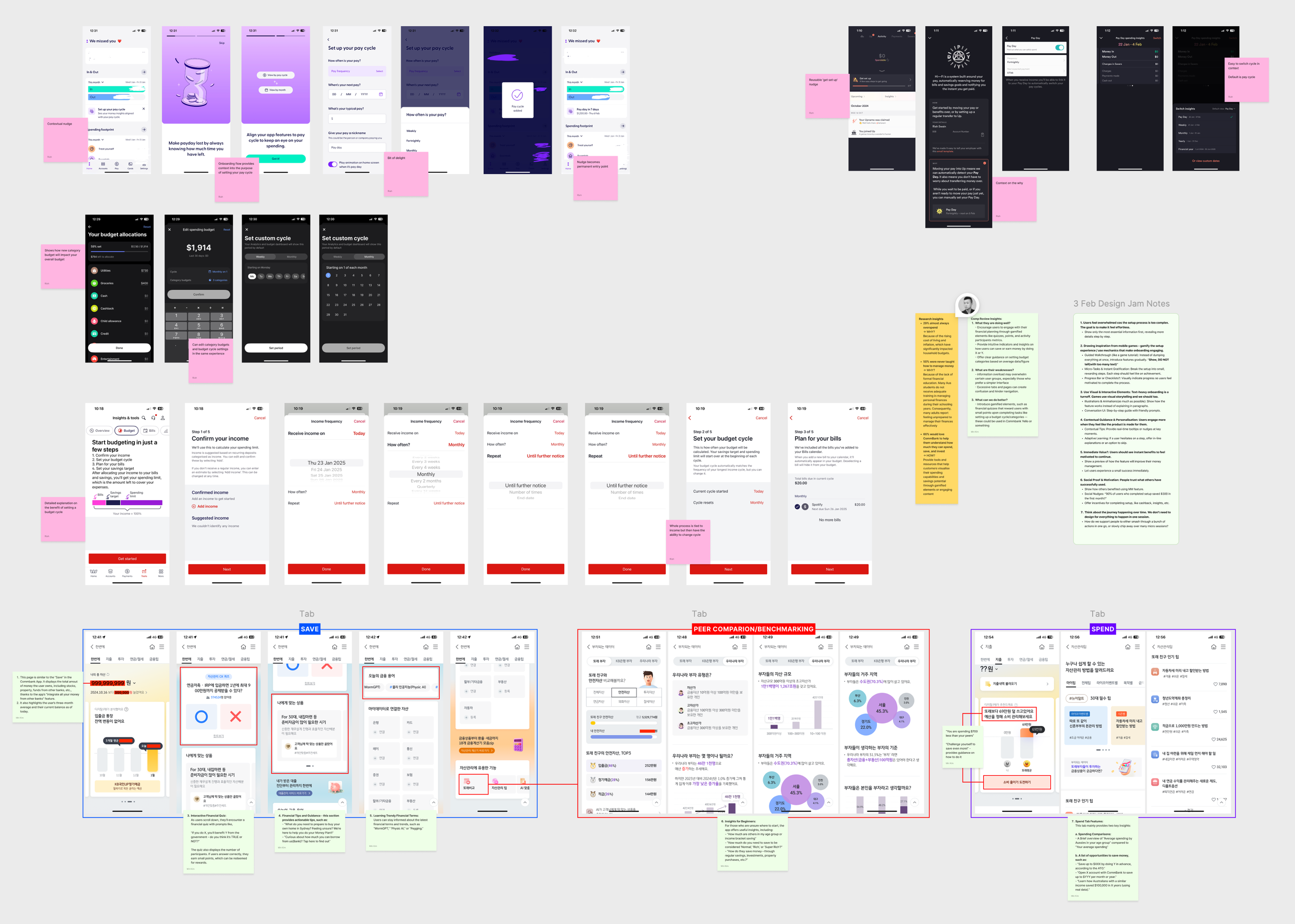
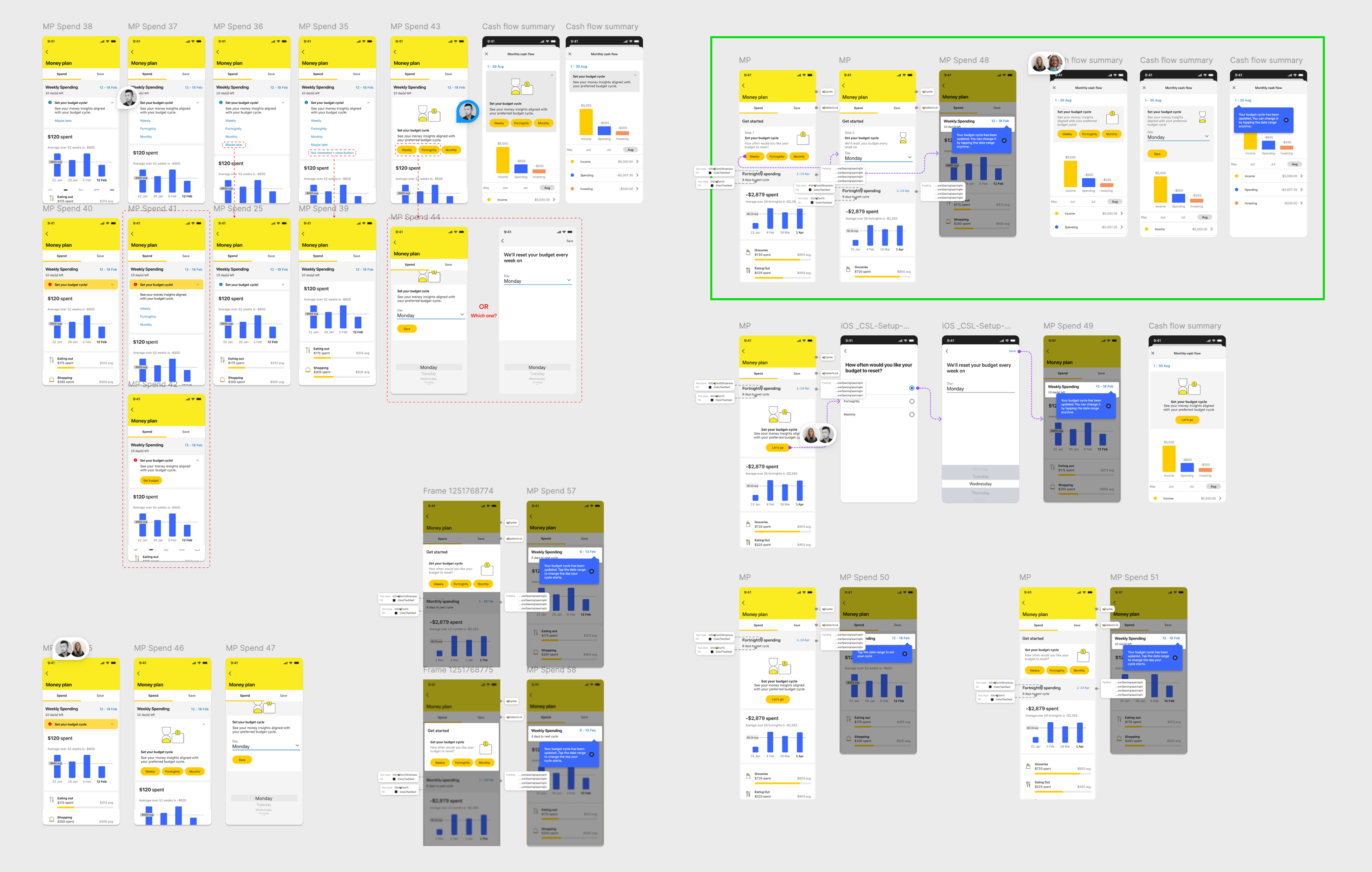
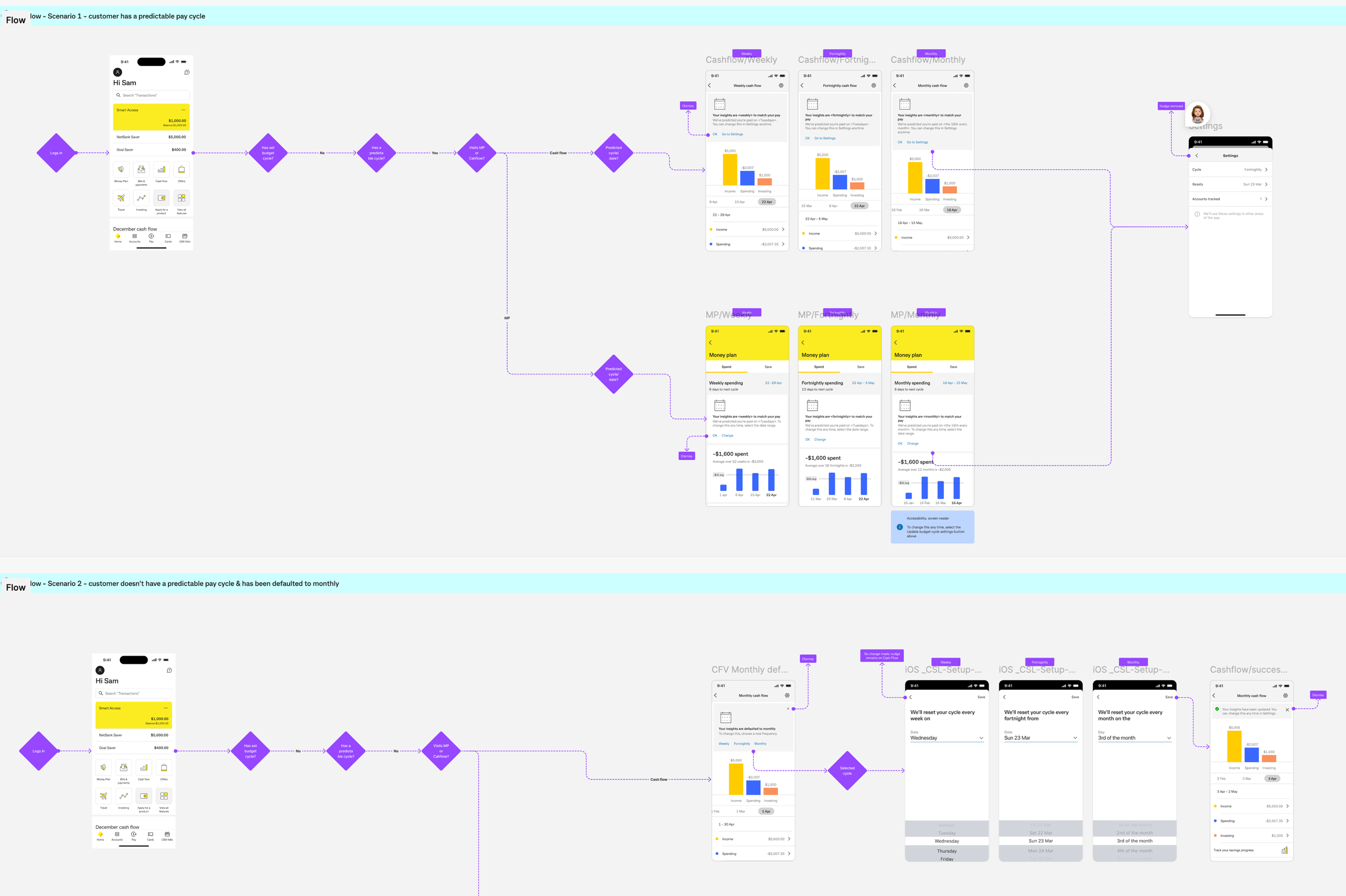
Many users had to manually change their budget cycle to match their pay cycle, which added friction to onboarding and setup.

Behavioural mismatch
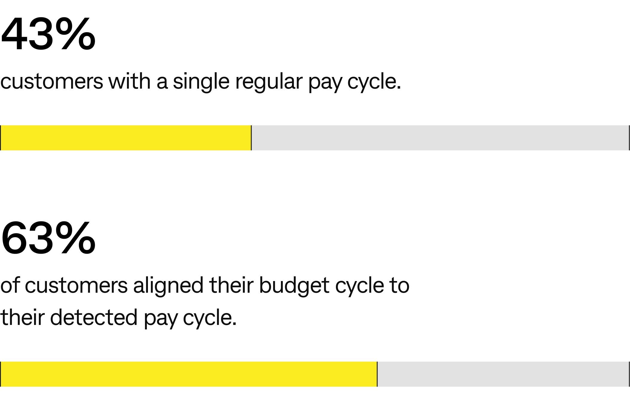
Despite fortnightly being the most common pay cycle, users in that group were also the most likely to choose a different budget cycle—indicating a deliberate attempt to correct the default

Increase engagement by automatically aligning users’ money insights according to their predicted pay cycle, and therefore mental model, without requiring extra effort.
.svg)
Increase awareness of the capability by providing clear visibility of the option to set a custom budget cycle and present customers with an active choice.
.svg)
Support the crew’s OKRs by driving customer adoption of the budget cycle feature.
.svg)
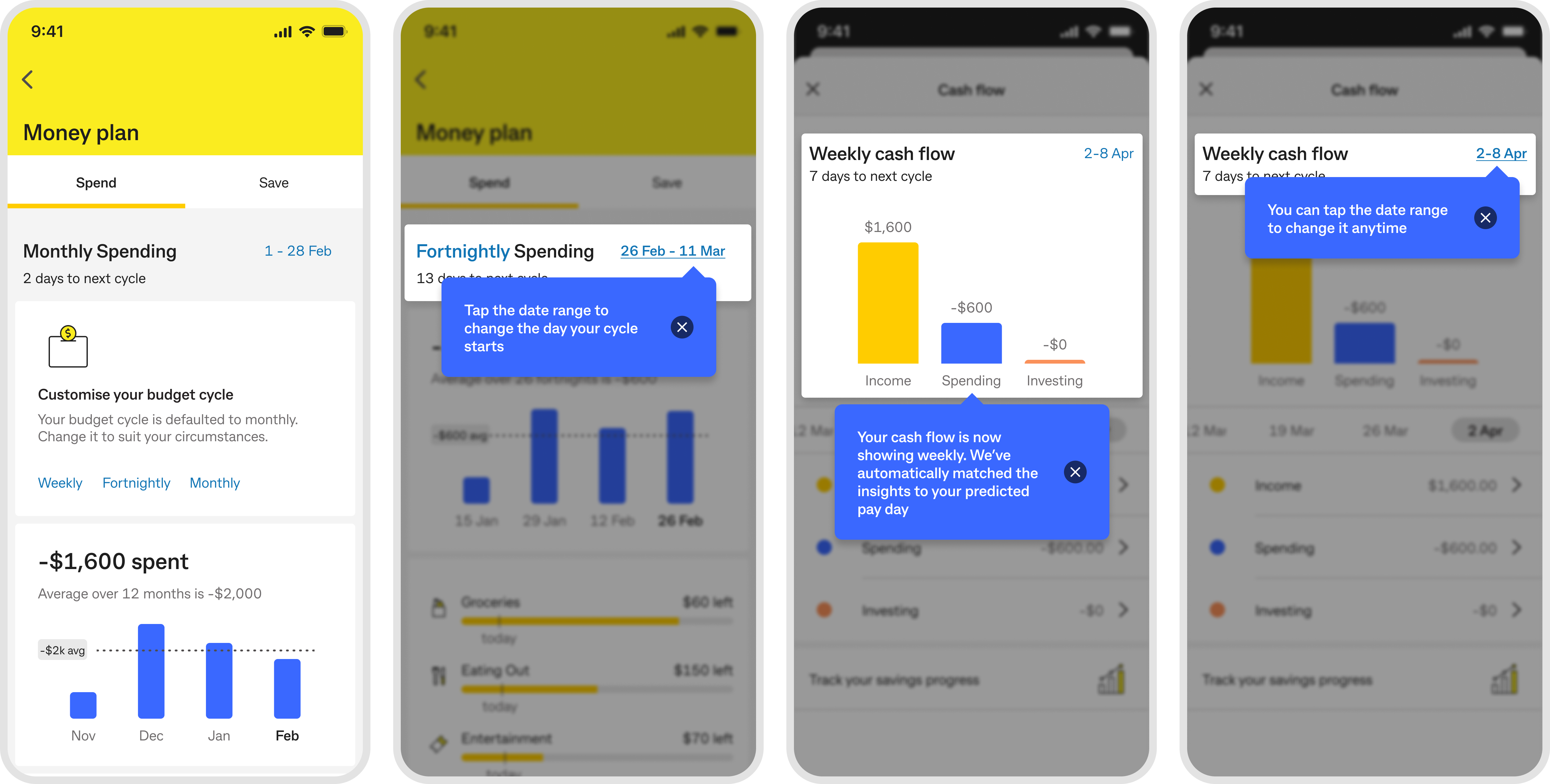
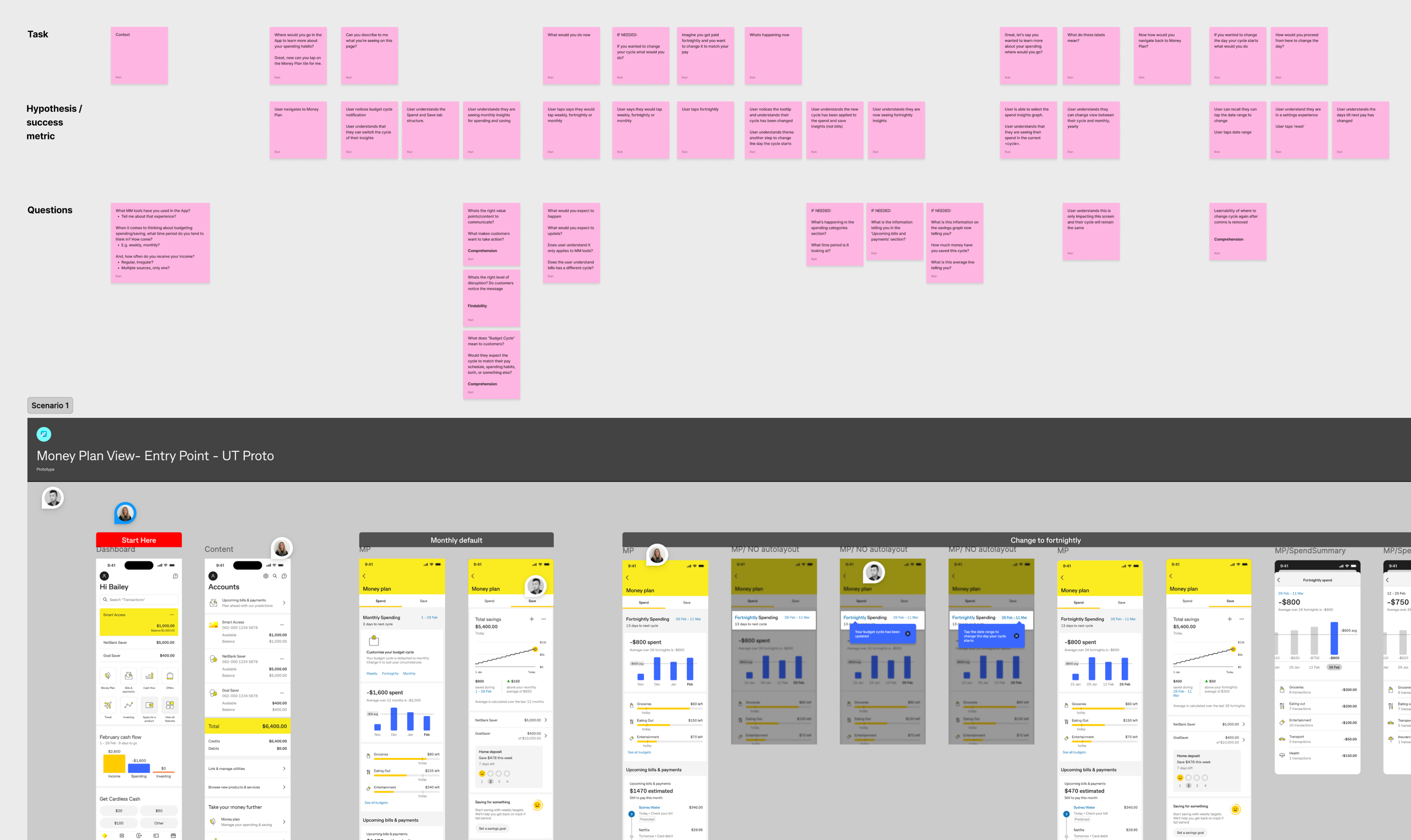
Automatically detect and match users’ pay cycles to reduce friction and increase relevancy.
.svg)
Allow users to easily change their budget cycle at any time.
.svg)
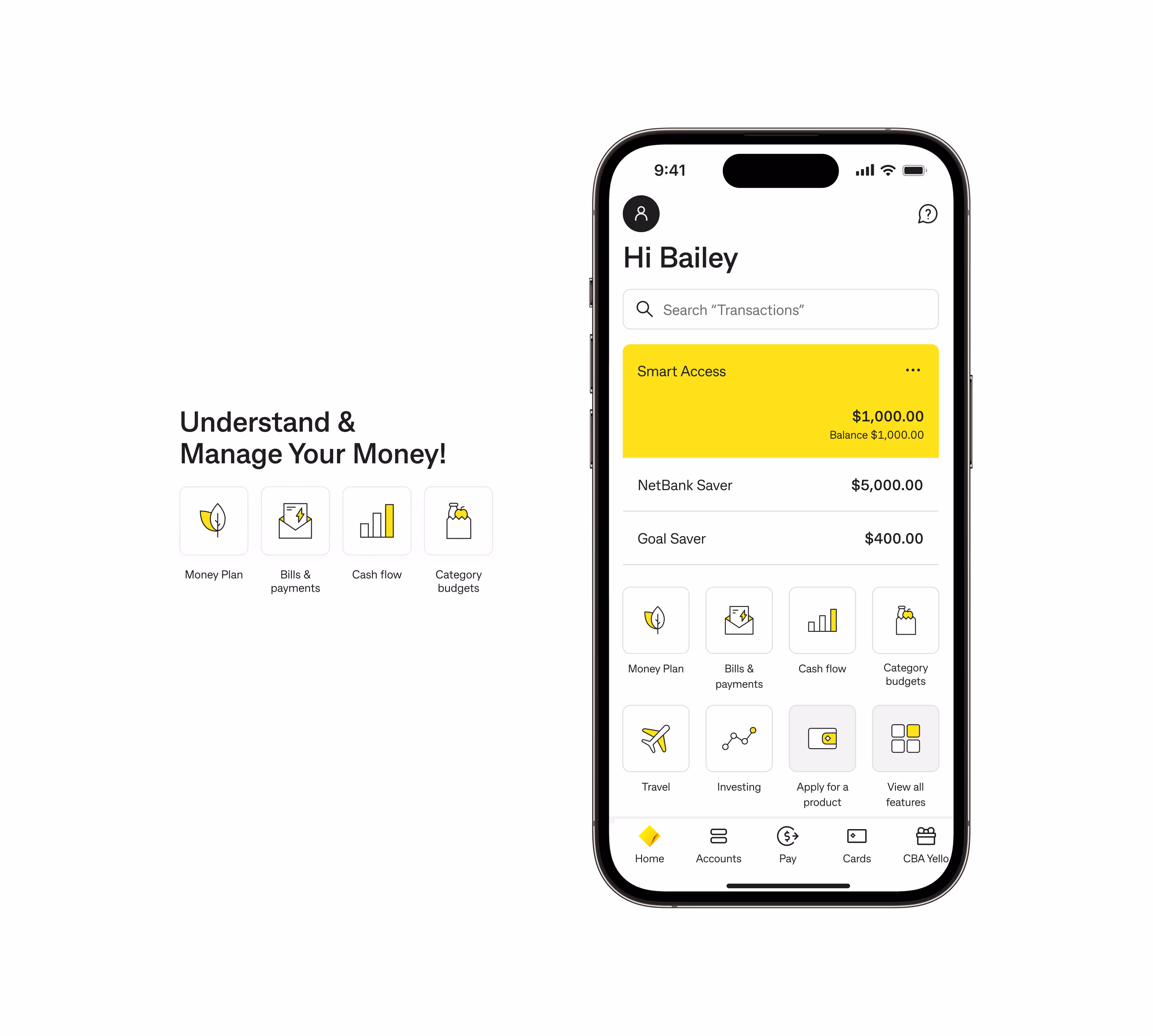
Present money insights in a way that matches users’ mental models.
.svg)
Provide clear, simple UX flow to educate users without overwhelming them.

01
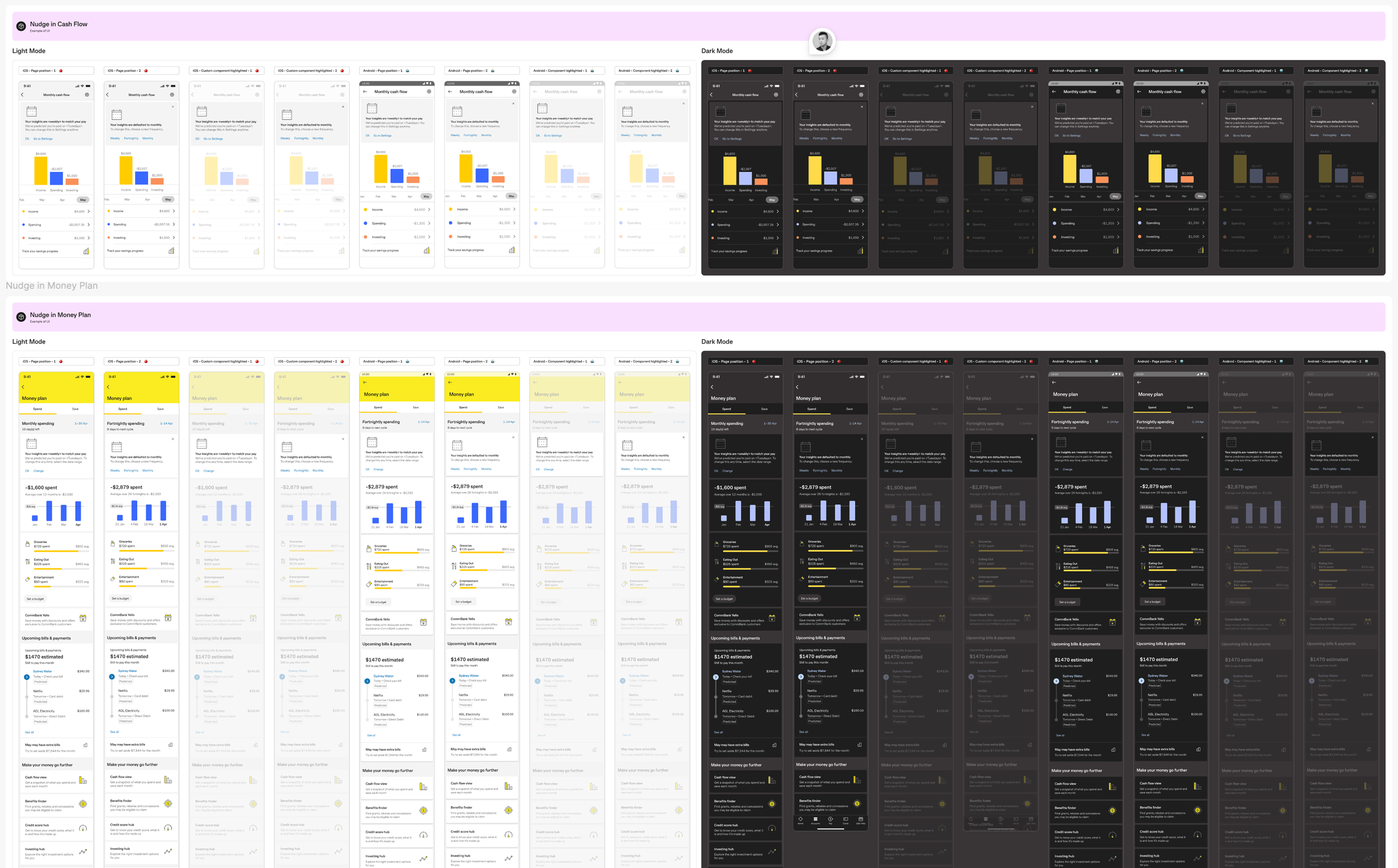
Tooltips
Although users found tooltips helpful at first glance, most did not actually read the details. When asked, many couldn’t recall the specific content.
02
Accessibility issues
The tooltip component was not technically feasible for this use case. For example, users with dynamic text enabled on their devices couldn’t fully read the content.
03
Animation
Without tooltips, we needed another way to capture attention. Research shows that animations can significantly improve engagement and help highlight important information.
01
219k customers onboarded
02
Business uplift
03
Reduced cognitive load
04
Increased engagement & trust
- Design doesn’t end at launch → continue iterating based on real user feedback to refine and improve the experience over time
- Early collaboration with engineering → address technical constraints upfront, reduce rework, and strengthen design strategy
- Explore further opportunities → build on this foundation to create more personalised, scalable, and engaging Money Management experiences for customers